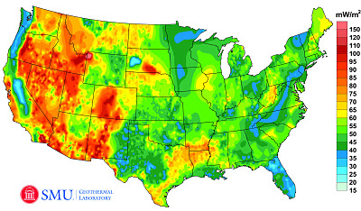


Geothermal Map of the United States
1Image Credit: Google Green Blog
According to the Google Green Blog, a recently completed project to update the Geothermal Map of North America by SMU Geothemal Laboratory (supported by Google.org), estimates that the technical potential of geothermal energy exceeds 2,980,295 megawatts. More details can be found on the blog here.

Google has also worked to develop this information as a layer in Google Earth. The file can be downloaded from a link towards the bottom of this page. The map shows Enhanced Geothermal Systems (EGS) Potential from depths from 3km to 6.5km and excludes protected lands such as National Parks.
An important note: I am not in any way endorsing EGS. Messing with the Earth at big scales makes me nervous, since we have so little information on the potential impact of our actions. I live in earthquake territory. Also, I read this alarming article in the New York Times a couple years ago. An excerpt:
All seemed to be going well — until Dec. 8, 2006, when the project [in Basel, Switzerland] set off an earthquake, shaking and damaging buildings and terrifying many…
As early as this week, though, an American start-up company, AltaRock Energy, will begin using nearly the same method to drill deep into ground laced with fault lines in an area two hours’ drive north of San Francisco.
…For geothermal energy to be used more widely, engineers need to find a way to draw on the heat at deeper levels percolating in the earth’s core.
Some geothermal advocates believe the method used in Basel, and to be tried in California, could be that breakthrough. But because large earthquakes tend to originate at great depths, breaking rock that far down carries more serious risk, seismologists say. Seismologists have long known that human activities can trigger quakes, but they say the science is not developed enough to say for certain what will or will not set off a major temblor.
It is well worth reading the entire article. And it is well worth remembering that just because it is called “clean” energy does not mean that there are no potential hazards associated with the energy production and use.

A Year of Sky
1This is a lovely video of the San Francisco sky for a year. According to the YouTube description,
A camera installed on the roof of the Exploratorium museum in San Francisco captured an image of the sky every 10 seconds. From these images, I created a mosaic of time-lapse movies, each showing a single day. The days are arranged in chronological order. My intent was to reveal the patterns of light and weather over the course of a year.
More information on the project site: http://www.murphlab.com/ahots
It is also a very clear illustration of how day length changes symmetrically over the year. All of the days are synchronized, starting and ending at the same time. So you can see that some days are much shorter and longer than others, and that sunrise and sunset happen a little earlier or later than the previous one. The exact times of sunrise and sunset depend on our latitude here in the Bay Area.
So… how does this connect back to resource efficient infrastructure?
Knowledge of the sun’s movement and its position in the sky at any given date and time are fundamental to energy efficient building design and the thermal and visual comfort of the building’s occupants.
