Spend San Francisco’s Transportation Dollars

If you were the budget czar for San Francisco, how would you allocate the city’s transportation dollars? Now, you can try your hand at making it all work online here. You can submit your final budget proposal, and it will be used to help develop the San Francisco Transportation Plan.

Check out the details here.

Snippets

After 100 years, San Francisco Muni has gotten slower [NY Times]

LBNL and UC Berkeley researchers measured emissions from drayage trucks in the Port of Oakland [EETD newsletter]

A report from UC Davis says water in California’s farm country is polluted by synthetic fertilizers [UC Davis]

A report from the Institute for Transportation & Development Policy chronicles the life and death of urban highways [ITDP website]

Photo: A front yard full of chard in Berkeley, CA, by Anna LaRue

Snippets – City Infrastructure

Today, stories about developing and improving cities and their infrastructure.

The City of Chicago announced the Chicago Infrastructure Trust, which will leverage private investment for retrofits pending City Council approval. For the first project, they will be doing an energy efficiency retrofit of municipal buildings (via Greentech Media).

Bay Area cities begin to adjust to life after redevelopment agencies shut their doors on Feburary 1st. A blog post by SPUR walks through the impact of these changes in San Francisco, Oakland, and San Jose.

Worldwide Parking Rate Survey

1

Colliers International published its 2011 “Global Central Business District Parking Rate Survey,” and the main verdict is that the cost of parking a car went up, in general, over the last year. However, the United States was an exception.

For the nerdy, the report lists average daily and monthly parking rates for a number of major cities. Did you know that in Tirana, Albania, the daily parking rate is equivalent to $6.18, but that in Oslo, Norway, the daily rate is $89.04? Or that in Bakersfield it is $8.00, but that San Francisco it is $26? Of the cities evaluated, San Francisco makes both the list of the top 50 most expensive daily rates and the 50 most expensive monthly rates.

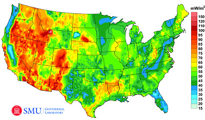
Geothermal Map of the United States

1

Image Credit: Google Green Blog

According to the Google Green Blog, a recently completed project to update the Geothermal Map of North America by SMU Geothemal Laboratory (supported by Google.org), estimates that the technical potential of geothermal energy exceeds 2,980,295 megawatts. More details can be found on the blog here.

Google has also worked to develop this information as a layer in Google Earth. The file can be downloaded from a link towards the bottom of this page. The map shows Enhanced Geothermal Systems (EGS) Potential from depths from 3km to 6.5km and excludes protected lands such as National Parks.

An important note: I am not in any way endorsing EGS. Messing with the Earth at big scales makes me nervous, since we have so little information on the potential impact of our actions. I live in earthquake territory. Also, I read this alarming article in the New York Times a couple years ago. An excerpt:

All seemed to be going well — until Dec. 8, 2006, when the project [in Basel, Switzerland] set off an earthquake, shaking and damaging buildings and terrifying many…

As early as this week, though, an American start-up company, AltaRock Energy, will begin using nearly the same method to drill deep into ground laced with fault lines in an area two hours’ drive north of San Francisco.

…For geothermal energy to be used more widely, engineers need to find a way to draw on the heat at deeper levels percolating in the earth’s core.

Some geothermal advocates believe the method used in Basel, and to be tried in California, could be that breakthrough. But because large earthquakes tend to originate at great depths, breaking rock that far down carries more serious risk, seismologists say. Seismologists have long known that human activities can trigger quakes, but they say the science is not developed enough to say for certain what will or will not set off a major temblor.

It is well worth reading the entire article. And it is well worth remembering that just because it is called “clean” energy does not mean that there are no potential hazards associated with the energy production and use.

A Year of Sky

1

This is a lovely video of the San Francisco sky for a year. According to the YouTube description,

A camera installed on the roof of the Exploratorium museum in San Francisco captured an image of the sky every 10 seconds. From these images, I created a mosaic of time-lapse movies, each showing a single day. The days are arranged in chronological order. My intent was to reveal the patterns of light and weather over the course of a year.

More information on the project site: http://www.murphlab.com/ahots

It is also a very clear illustration of how day length changes symmetrically over the year. All of the days are synchronized, starting and ending at the same time. So you can see that some days are much shorter and longer than others, and that sunrise and sunset happen a little earlier or later than the previous one.  The exact times of sunrise and sunset depend on our latitude here in the Bay Area.

So… how does this connect back to resource efficient infrastructure?

Knowledge of the sun’s movement and its position in the sky at any given date and time are fundamental to energy efficient building design and the thermal and visual comfort of the building’s occupants.

THIS POST IS PART OF OUR FRIDAY VIDEO SERIES.

Snippets

 San Francisco and Oakland rank among the top 10 most walkable big cities in the country.  Lawrence Berkeley National Lab is working hard to cut its carbon emissions.  BART and MUNI management are both in transition.

Pecha Kucha Rundown: Denser, Part 2

2

Noelle and I had fun at Pecha Kucha in San Francisco at the SPUR Urban Center on June 21.  For those unfamiliar with the Pecha Kucha format, each speaker has 20 slides and 20 seconds per slide. The format makes for a fun but focused look at what a wide range of professionals is working on and thinking about. Presentations are loosely organized around a theme. The theme this time was “Denser.”

Using my notes, I am putting together a set of posts that lists the presenters in order, along with links to their website (if I could find them) and any major thoughts I jotted down. For some presentations, I took a number of notes. Other presentations have fewer notes (maybe I was looking at the images more carefully?). All of the presentations were more interesting and beautiful than revealed by my notes and these posts.

– – –

Elizabeth Shreeve – Principal – SWA Group

looking at what vertical cities and high density mean for the ground plane

high tower in Dubai – a building becomes a city district by itself

65% of the firm’s work is in China right now

– – –

Paul Jamtgaard – Architect, Urbanist – Group 4 Architecture

“Intensity in 10 Cities”

density x uniformity = monotony = DEATH

density x diversity = intensity = VITALITY

diagram of density in cities

density of people per square km in Portland, Mumbai, New York City, Tokyo, Singapore, Rio de Janeiro, Hong Kong, Istanbul, Copenhagen…

housing = human storage? or urban living

– – –

Ben Grant – Public Realm + Urban Design Manager – SPUR

city skylines as a bar graph of property values

looking at historical increasing density of use of same lot in NYC – eventual mandating of air shafts

density / setbacks – effect above the ground plane

residential density vs auto ownership [looked at 2 maps]

green architecture in the 1970s was away from the city

aesthetic integration of greenery + verticality

Donald Appleyard – Livable Streets (1981)

SFPUC looking at how to manage stormwater

– – –

Part 1 is posted here. Part 3 will be posted tomorrow.

– – –

Pecha Kucha Rundown: Denser, Part 1

3

Noelle and I had fun at Pecha Kucha in San Francisco at the SPUR Urban Center on Tuesday.  For those unfamiliar with the Pecha Kucha format, each speaker has 20 slides and 20 seconds per slide. The format makes for a fun but focused look at what a wide range of professionals is working on and thinking about. Presentations are loosely organized around a theme. The theme this time was “Denser.”

Using my notes, I am putting together a set of posts that lists the presenters in order, along with links to their website (if I could find them) and any major thoughts I jotted down. For some presentations, I took a number of notes. Other presentations have fewer notes (maybe I was looking at the images more carefully?). All of the presentations were more interesting and beautiful than revealed by my notes and these posts.

– – –

Grady Gillies – Architect – UCLA, Suprastudio

DENSE city

dense buildings

dense population

dense space

dense community

Looked at 8 cities as part of the studio, including:

Cleveland, OH – transforming access and landscape

Flint, MI – advantage of a shrinking city’s migration is SPACE

New Orleans – blighted property presents an opportunity

Tucson, AZ – relentless expansion of the city edge

Merced, CA – looking at potential impact of high-speed rail

Toledo, OH – city’s solar industry as a new urban identity

More information on the studio and work:

http://www.suprastudio.aud.ucla.edu/

– – –

Craig Scott – Architect – IwamotoScott

DENSER

environmental / technological performance

spatial / material geometry

urban / architectural experiences

3 focuses of firm’s practice – buildings, installations, and digital fabrications

– – –

Robin Levitt – Detroit

(Anna’s note – his entire introduction was “Robin Levitt, Detroit” but there is a little info on the ever-helpful Wikipedia)

Talking about the de-densification of a city

Birthplace of the automobile

Detroit was the Silicon Valley of its day

1950s saw Detroit’s population peak just under 2 million

[Image of reduction in building density in the downtown district]

Detroit could geographically fit San Francisco, Boston, and Manhattan, but has a much lower population density

Population decline over the years

But actual geographical area of the city was expanding

Ruins now dominate the Detroit landscape

Neighborhoods have been cleared

City looking at a strategy of controlled abandonment

City of Detroit began as farmland, and in many neighborhoods it is returning to farmland

– – –

Parts 2, 3, and maybe 4 coming soon!

– – –

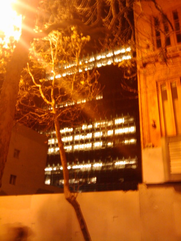
The San Francisco Federal Building…at 2 AM

2

Yes, it’s true. While I was waiting for a TransBay bus near Civic Center at 2 am a couple weeks ago (not something I do often), I was thinking about energy efficiency.

I took the following (terrible) cell phone photo of the Federal Building from Market Street:

And I wondered, “Why are all those lights on?”

– – –

There are a number of reasons that entire floors of lights might be on in a building in the middle of the night. Reasons could include:

  • Cleaning crews come in after workers leave and turn all the lights on a floor on
  • A few folks are working really, really late and can only control large areas of lights
  • Sensors or timers that turn off the lights are not functioning properly
  • Nobody knows how to turn off the lights

But the San Francisco Federal Building is touted as a high-performance low-energy building. And someone else has previously noticed lights on late at night. So what’s going on?

I’m going to see what I can find out in the next week or two and will write a follow-up post.

– – –

More information on the San Francisco Federal Building is available from the architects (Morphosis),  Flex Your Power, the San Francisco Chronicle, and a case study by Rocky Mountain Institute.

– – –