Map of Extreme Weather in 2012

2012 was a year of extreme weather events, with record heat waves, significant drought across the Southern and Western States, and major wildfires. A map posted by the Natural Resources Defense Council (NRDC) allows users to watch the events on the national map over the course of the year.

The map also allows user to look at a summary of extreme weather events at the state level.

2013-06-09_NRDC extreme weather map_Fullscreen capture 692013 23624 PM

According to the NRDC, in 2012 California experienced:

  • Record-breaking heat in 15 counties
  • Record-breaking snow in 5 counties
  • Record-breaking precipitation in 18 counties
  • 102 large wildfires

The website lets users see the specific records set (for example, the records for monthly highest maximum temperature below) and the previous record.

2013-06-09_NRDC extreme weather map_Fullscreen capture 692013 24150 PM

For those (like me) who like to know the source of the data, the map was based on data from the National Oceanic and Atmospheric Administrations’s National Climatic Data Center.

2011 State Energy Efficiency Scorecard

– – –

The American Council for an Energy Efficient Economy (ACEEE) has posted its 2011 State Energy Efficiency Scorecard. California is ranked #2, behind Massachusetts.

You can see the California information here.

The full scorecard ranking can be found online here.

Tracking Water Resources in Real Time

2

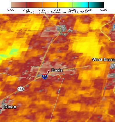
Image credit: SEBAL North America

According to a recent press release, scientists at SEBAL North America, located in Davis, California, are tracking real-time consumption of water by crops, cities, and natural ecosystems using satellites.

This new technology, applicable to water management needs globally, reduces substantial uncertainties in traditional approaches, greatly increasing confidence in water management decisions. Grant Davids, the company’s president, notes the broad range of applications of SEBAL for water managers. “Water consumption is usually the most important yet often most poorly quantified water management parameter. More accurate and spatially discrete estimates of consumptive use lead to improved water management over a wide range of conditions, from local to basin scales and from historical analysis for planning to real-time operations decision support.”

The company will be providing weekly maps showing water use for the Central Valley. The company also makes image overlays that can be opened in Google Earth to allow users to look more closely at water use in specific areas. Maps and data can be found on the SEBAL website.

– – –

Assorted Links

For the first time in 35 years, the United States Department of Energy (DOE) is moving to enforce decades-old energy efficiency and water conservation standards.

ICLEI USA has compiled a list of cities taking action to reduce their GHG emissions.

NPR has a map showing renewable energy goals and renewable energy generated for each state.

– – –

California’s “Air Basins”

1

The state of California is divided geographically into 15 different “air basins” in order to regulate air emissions on a regional, rather than a local basis. The divisions were decided upon based on both geographically like features (in some cases “air basins” are literally geographic basins surrounded by mountains) and by political boundaries, such as counties. While air quality can vary from basin to basin, emissions and pollution are obviously not confined to air basin boundaries.

The nine county Bay Area makes up its own designated air basin, the “San Francisco Bay” air basin. This basin is home to the second largest metro population in the state and is characterized by high vehicle miles traveled, several regional airports and industrial activity. Being a coastal region, wind and weather patterns can have a dramatic effect in transporting the pollution from the region into inland areas.

To find out more about the San Franciso Bay air basin and the 14 other air basins in California, visit the Air Resource Board’s interactive map here, get the latest air quality reports for your region from the annual California Almanac of Air Quality and Emissionsand check out a list of 50 things you can do to improve California’s air quality, here.

– – –

NRDC Report on Climate Change, Water and Risk

Image: NRDC

The Natural Resource Defense Council (NRDC) has released a study, conducted on their behalf by Tetra Tech, which examined the effects of climate change on probable future water supply and demand in the United States. One of the main findings of the study is that one-third of the U.S. counties (> 1,100 counties) will likely face water shortages by 2050.

The full report is available as a PDF here.

The Water Supply Sustainbility Index developed by Tetra Tech for the report can be viewed interactively in Google Earth – a link to the data can be found on the NRDC’s website here. You can also turn on and off markers for which counties are top producers of different crops to get a sense of the potential impact of the water shortages. It looks like this (the green dots indicate that the county is one of the top 100 counties for producing vegetables):

The NRDC also released a one-page overview of water shortage risk and crop value in at-risk counties by state (as a PDF here). According to the overview of California’s risk due to climate change:

Percent of CA counties at risk of water shortages: 83%

Total number of CA counties at risk: 48

Total number of CA counties at extreme risk: 19

Total number of CA counties at high risk: 17

Total number of CA counties at moderate risk: 12

The value of all the crops being producing in at-risk CA counties (in $1,000s): $21,585,354

– – –

Visualizing the U.S. Power Grid

2

Source: NPR’s Power Hungry: Reinventing the U.S. Electric Grid series

National Public Radio produced an intriguing series in April and May of 2009 called “Power Hungry: Reinventing the U.S. Electric Grid“.  The series looked at the structural make-up of power conveyance in the U.S.-and the need for it to get ‘smarter’ about controlling and tracking consumption patterns- and, at the growing pains of the newer energy industries such as wind and solar, and how to get them online to more Americans.

But the real star of the show for us map fans is the great interactive map, pictured above. The map illustrates the three discrete “grids” that make up the U.S. power network: Western, Eastern and Texas. The map also includes existing and proposed lines,power source ratios for each state (coal, hydro, etc.) and the distribution of wind and solar plants. See the full interactive map here.

– – –

Stimulus Money for Energy Efficiency

1

The Sacramento Municipal Utility District (SMUD) will receive $20 million from the federal stimulus funds designated for California. The money will launch a Home Performance Program, which will offer HERS audits and energy upgrades to about 15,000 homes in SMUD territory. Because the program is expected to increase demand for trained contractors and auditors, SMUD will be working with the Sacramento Employment and Training agency and Los Rios Community College to develop training programs – via SMUD.

The California Energy Commission also approved $8 million for the County of Los Angeles, $3 million for the County of San Diego, and $1.9 million for the City of Fresno from Recovery Act Energy Efficiency Conservation Block Grants for residential energy retrofit programs – via Imperial Valley News.

– – –

There’s a cool map of hotspots where water and energy are coming into conflict around the world –  IEEE Spectrum.

– – –

There’s a new study from Arizona State University that analyzes the life cycle impact of swimming pools in nine cities in terms of their consumption of chemicals, water, and energy – via Environmental Science & Technology.