Finding Local Stimulus Projects

1

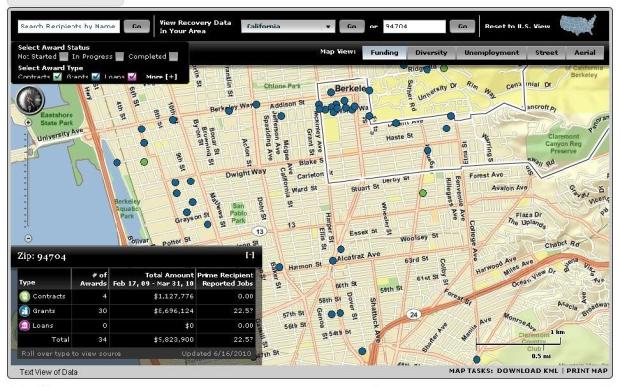
Recently while driving around Northern California, I’ve seen a number of signs saying “This project is supported by ARRA funds.” And I started wondering where all the local projects were. It turns out that if you go to Recovery.Gov, there is a map (here) where you can search by state or zip code to find nearby ARRA projects, as that information has been reported by the recipient of the funds.

photo credit: recovery.gov

You can click on each dot to get information about the organization and amount awarded.

You can see summaries by state (see California here) for different categories – by zip code, by top recipients, by top infrastructure projects, top congressional districts, by the funding federal agency, and by the jobs reported created.

Global Warming’s Six Americas

1

This post is part of an ongoing effort to discover, and provide a venue for, data collection , reports,  and metrics related to the topics of waste, water, energy and transportation.

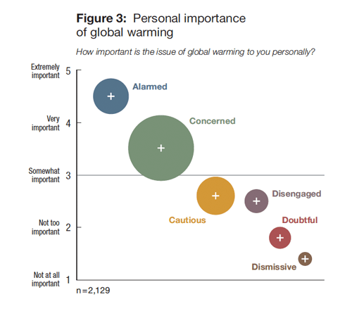
A graph from the Global Warming’s Six Americas report

Global Warming’s Six Americas is a report released in May of 2009 by the George Mason University Center for Climate Change Communication, and Yale’s Project on Climate Change Communication,  illuminating American attitudes towards global climate change and climate change policy. The report has the stated premise that “Climate change public communication and engagement efforts must start with the fundamental recognition that people are different and have different psychological, cultural, and political reasons for acting – or not acting– to reduce greenhouse gas emissions”.

The group used data gathered during 2008 from an in-depth questionnaire to assess attitudes, concerns, perceptions, risk values, policy preferences and other identified survey dimensions, ultimately enumerating 6 common response types among Americans at large regarding issues related to global climate change.

The six “types” identified by the report are the Alarmed (18%), the Concerned (33%), the Cautious (19%) , the Disengaged (12%), the Doubtful (11%), and the Dismissive (7%). Each group corresponds to a distinct station on the spectrum of attitudes and responses cataloged by the researchers.

It never hurts to hear it again: with only 5% of the world’s population, America is yet responsible for 25% of greenhouse gas emissions (GGE)s. This, argues the report, is why understanding the diverse views of the American public on climate change is so crucial for and understanding our collective behaviors and for creating effective public education and policy messages.

Read the full “6 Americas” report here.
Finding Data – The Greendex

1

photo link

For the third year running National Geographic has teamed up with Globe Scan to provide the Greendex, an annual survey designed “to develop an international research approach to measure and monitor consumer progress towards environmentally sustainable consumption.”  Specifically, the Greendex is a tool to help consumers worldwide to both understand their consumption patterns and to be able to view them within context to others.

The Greendex survey questions were designed to capture the participant’s knowledge, behavior and views on environmental issues and consumer habits ranging from transportation to food choices. The study is based on a sample of 17,000 individuals in 17 countries (14 in 2008). So, while perhaps not a truly  “definitive” study on a global scale, the Greendex survey countries represent the heaviest hitters in terms of resource consumption, and the Greendex 2010 Report provides some interesting insights.

Some notables from the study:

– Respondents from 10 of the 17 countries polled showed an increase in “environmentally friendly consumer behavior” between this year and last.

– Consumers with the highest rankings for “green” choices are in developing nations. Top scores go to India, Brazil and China (in that order).

– Uh-oh USA … we’re showing slight improvement relative to ourselves last year, but we’re still at the bottom of the heap.

– The strongest changes in personal behavior that made positive impacts were in the Housing category (home energy efficiency).

Read the highlights report here.

Calculate your own personal “Greendex” here.

And finally, how reliable are self-reported behavior surveys anyway? Separate the fact from fiction with the Market Basket report.

Finding Data – Watershed Mapping

1

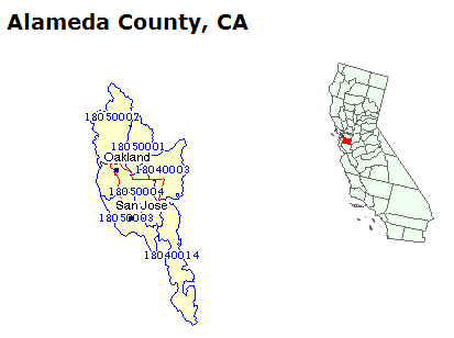
Pictured above is the U.S. EPA 'Surf your Watershed' site’s display of the six watersheds of Alameda County.

‘Surf your Watershed’ is an excellent tool from the U.S. Environmental Protection Agency that helps you find basic data on all the watersheds in your county. The site includes U.S. Geologic Survey data, water quality information, and links to local citizen’s groups working on water stewarship, clean up and other  issues (39 in Alameda County!)

Check it out

Finding Data – The Water Intensity of Food

3

Many of us have heard that we should eat locally grown food to reduce the energy needed to transport and preserve the food between the source and our table. Many of us have also heard that we should reduce our meat consumption to reduce the amount of land and other resources needed to support our diets and lifestyles. Another metric to consider is how much water is needed to produce different foods.

Based on values from the Water Footprint Network, I compiled a chart of how much water is needed to produce certain foods. This is obviously not an inclusive list of all foods, but gives an idea of the range of values for different kinds of foods. These values will also differ in different countries and regions. As noted by the director of the Water Footprint Network, Arjen Y. Hoekstra, “Water problems are often closely tied to the structure of the global economy. Many countries have significantly externalised their water footprint, importing water-intensive goods from elsewhere. This puts pressure on the water resources in the exporting regions, where too often mechanisms for wise water governance and conservation are lacking.”

In the table on the left, values are generally for liters per kilogram unless otherwise noted. In the table on the right, values are generally for gallons per pound unless otherwise noted.

You can calculate your own water footprint with this calculator for an estimate of which parts of your diet and lifestyle are most water intensive.