Two Years of Zero Resource

Over the last two years, we have covered a number of topics, from tiny houses, to DOE rules on showerheads, to definitions of terms.

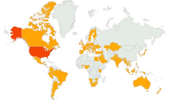
Since the end of February, when WordPress starting showing the statistics, Zero Resource has attracted readers from all over the world.

Over the last two years, the top twenty most popular posts of all time are:

  1. Death Rays
  2. More Tiny Houses
  3. The Difference Between the CEC and CPUC
  4. Tour a Tiny Apartment in Spain
  5. Putrescible Waste
  6. Finding Data – GDP and Electricity Consumption
  7. Alex Wilson, Founder of EBN – Part 1
  8. Plastic Bag / Retail Bag Laws in the U.S.
  9. Bad News About CBECS 2007
  10. Nina Maritz
  11. Are People Clueless about Energy Savings?
  12. MRF (Rhymes with Smurf)
  13. Resilience vs. Sustainability
  14. The Key System
  15. Visualizing the U.S. Power Grid
  16. Do Green Roofs Improve Solar PV Performance?
  17. Extended Producer Responsibility (EPR)
  18. Local Target Stores & Hazardous Waste
  19. Tiny “Spite” Houses
  20. Houses – Small, Reused, and Prefab

Many thanks to all the Zero Resource readers around the world! We look forward to another year.

Finding Data – GDP and Electricity Consumption

2


I thought it would be interesting to graph GDP against a metric of per capita energy use (in this case kWh/capita).

(Click on the chart to see a larger version.)

There are a number of interesting things to note about this chart. First, compared to the other countries shown, the United States has a really high GDP. Counting countries individually (sometimes the European Union is counted as one entity), the USA has the highest GDP, then Japan, then China. In general, the chart indicates that as a country’s GDP increases, so does kWh/capita. If we also take the size of the population into account, this is one reason many people are increasingly concerned about the potential effects of economic growth in India and China on climate change. Exceptions on the chart seem to generally be very cold countries (Canada, Sweden, and Russia) or very hot countries (Australia and Saudi Arabia).

In the chart above, the data comes from Key World Energy Statistics 2009, put out by the International Energy Agency (data is for 2007).

Electricity consumption is calculated for the entire country as gross production + imports – exports – transmission/distribution losses. It is then divided by the population of the country to get the per capita value.